Recherches récentes
Options de recherche
#ggplot


r-graph-gallery.com provides example code for a variety of chart types, both in base R and ggplot: https://r-graph-gallery.com/ #rstats #ggplot #design

Jazz up your ggplots:
‘Useful tricks to elevate your data viz via `ggplot` extension packages in R”
Custom themes, fonts, annotations, arrows & more
By the USGS
https://waterdata.usgs.gov/blog/ggplot-jazz/
#RStats #ggplot2 #ggplot #Dataviz

The truly important reason to try the #positron R/Python editor is that it can work in parallel with another R session open in #RStudio for a different project...
Also amazed by the #Pluto notebook for #Julia scientific work. One of its nice features is that the associated file is in text format and the code can be easily extracted. Not yet ready to switch from #ggplot to #VegaLite though.
https://positron.posit.co/start.html
https://plutojl.org/
#rstat

Played around with labeling a line plot. Ended up using:
 {directlabels} for the two curved lines{geomtextpath} for the horizontal line
Felt like an hour well spent. 
Removed actual labels to avoid starting a totally different conversation, but a keen eye might spot the topic!


 between two people. Portions of overlapping speech marked in red. There are many of them.")

I found a great excuse to make a bunch of fun ggplots. As if I needed one.


From Weverthon Machado: “ When teaching or giving a talk, do you like presenting plots step by step, revealing e.g. one group at a time? This is often useful for walking through complex results.
“I made a R package that makes it extremely easy to do this!
“ggreveal: Reveal a ggplot incrementally”

Why we must internationalize the source code (yes) of computer programs, a concrete example: ggplot has both scale_color_continuous and scale_colour_continuous (note the british letter u).

I'm sure the answer to this is write something myself. But it would be great if there was a #ggplot solution to:
- show individual points* for categories
- add summary crossbar ± error
- and do faceting
all from one data frame.
* ideally geom_sina from `ggforce` which I love.
The package `ggpubr` is very close, but not quite flexible enough.
Add some swag to your ggplots, with fontawesome symbols and colors: https://nrennie.rbind.io/blog/adding-social-media-icons-ggplot2/ #rstats #ggplot #fontawesome #ggtext
r-graph-gallery.com provides example code for a variety of chart types, both in base R and ggplot: https://r-graph-gallery.com/ #rstats #ggplot #design
Dr. Albert Rapp shows how to re-create an elaborate diverging bar chart using R and ggplot2. Original chart was from the Pew Research Center.
It's a lot of code, but the results are publication quality.
Video: https://youtu.be/nTbzO-RjABo?si=o4ck_e0Z5iAaFqiO
Blog post with code: https://albert-rapp.de/posts/ggplot2-tips/22_diverging_bar_plot/22_diverging_bar_plot


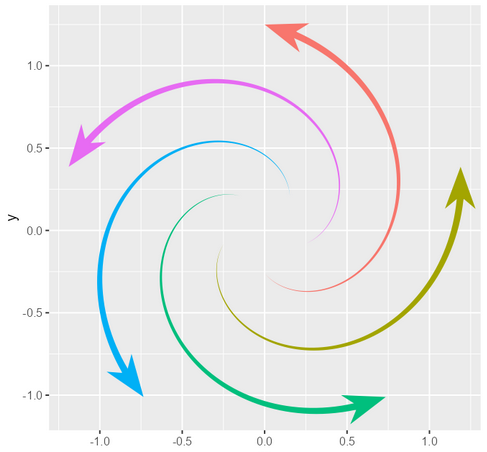
Examples of creative data visualizations, mostly ggplot: https://github.com/tashapiro/tanya-data-viz #ggplot #dataviz #rstats

Who wins Premier League 2024? Here is the result of a Monte Carlo simulation to estimate the chances.
#pl #arsenal #PremierLeague #ManCity #England #MCFC #EPL #RedTogether #LFC #r4ds #dataviz #DataScience #football #rstats #ggplot
